Data Visualisation: Endangered Safari
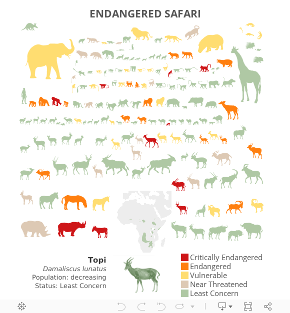
This visualisation illustrates the population stability and endangered status of large African mammals. Animals facing left are decreasing in population whereas animals facing right are stable or increasing. RJ’s use of color emphasizes the most crucial information while his use of shape and placement make this visualization delightful to look at.
Simply dig into the data by hovering over the animals to learn more about each animal’s population status.
This visualisation was developed using Tableau 9.0.
Adapted from INFO WE TRUST