Blocking out the noise – How to detect, handle and visualise outliers
Oprah Winfrey is one of the most famous names on the planet nowadays, having had an incredibly successful career as a talk show host for over 20 years and with an estimated net worth of $2.5billion. It is now also common knowledge that she was brought up in a poor family and experienced an incredibly traumatic upbringing – facts that possibly make her rags-to-riches story more inspirational to the public eye. What makes her story more incredible is how rare it is for someone to overcome adversity and go on to such great success. It would be fair to say that Winfrey is indeed an anomaly.
Anomalies are not only present in the world of entertainment, but they also come up in our day-to-day lives as well, including in our jobs. Consequently, they are capable of influencing key decisions made by key stakeholders, potentially without their knowledge.
Let’s take a relatively straightforward example: suppose you are looking at the sales from the previous quarter in order to determine what you should expect in the current quarter. Of the 25 sales that were successfully made, you notice that there is an average of just over $40,000 – this looks pretty impressive to you, but you are struggling to recall too many occasions when you made sales of over $1000, let alone $40,000! Looking at the individual sales, you notice one that drowns out the rest, a sale of 1,000,000. This sale was quite the anomaly, and when you take it out of the equation, your average is just around $400. So, what is the right move here? Do you factor it into your thinking for future projections, or discard it completely?
How to Spot Outliers using Visualisations
You might say that it’s all well and good to look through 25 individual records to spot outliers, but this case involves a far larger volume of data. Looking through every record individually would be incredibly fiddly, and likely a waste of precious time.
Sifting through records in your data should never be the first action you take. As a starting point, one should make use of a method that cleanly summarises your data while still making it clear when you have records that are far astray from the rest. We are of course referring to visualisations, and there are quite a few of them that can prove useful in this regard. The first of these is the histogram, an example of which is shown below.
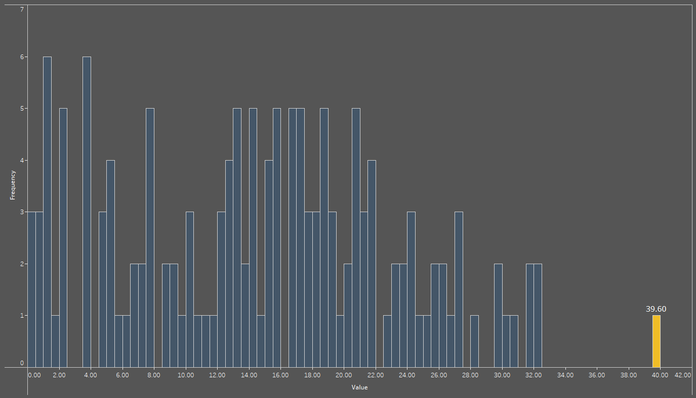
For the uninitiated, a histogram’s purpose is to group data points into ranges; the horizontal x-axis indicates the ranges, while the vertical y-axis shows how frequent it is to find a data point whose value lies within that range. For instance, the bar highlighted in gold at the end of the histogram represents a single data point (as indicated by a value of 1 on the y-axis) with a value of 39.6, found within the range of 39.5 to 40. We should probably add that the range can be user-defined: in this use case, a range of 0.5 was considered to be ideal, but ranges may be as small or large as necessary.
One additional thing that can be noted is how far away to the gold bar is from the remaining blue bars, indicating the possibility that the record represented by the gold bar is some sort of anomaly. While it is not as different from the rest as the example provided earlier on, it may still skew global averages. We will discuss whether to keep such values or not in an upcoming section.
The histogram is not the sole tool at your disposal that allows you to find these anomalies in your data – the second option we will be discussing is the boxplot.
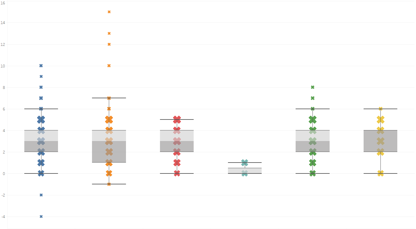
Within the boxplot shown above, the vertical y-axis represents values of individual data points, while the horizontal x-axis is categorical. Additionally, the size of the “X” symbol represents how frequent a value was within a dataset, with a larger “X” indicating higher frequencies. 50% of your data will be contained within the central part of a boxplot, depicted here by grey shadings around the “X” marks, and at the centre of this “grey area”, one can find the median of their data. You’ll also be able to note that each boxplot has whiskers (for the blue category, these are located at values 0 and 6); any values outside these whiskers can be considered as potential outlying values.
One thing that both aforementioned methods have in common is that they focus on one numeric field at a time – what should I do if I would like to spot anomalies based on two numeric fields? That is where we bring in the final weapon on display today: the scatter plot.
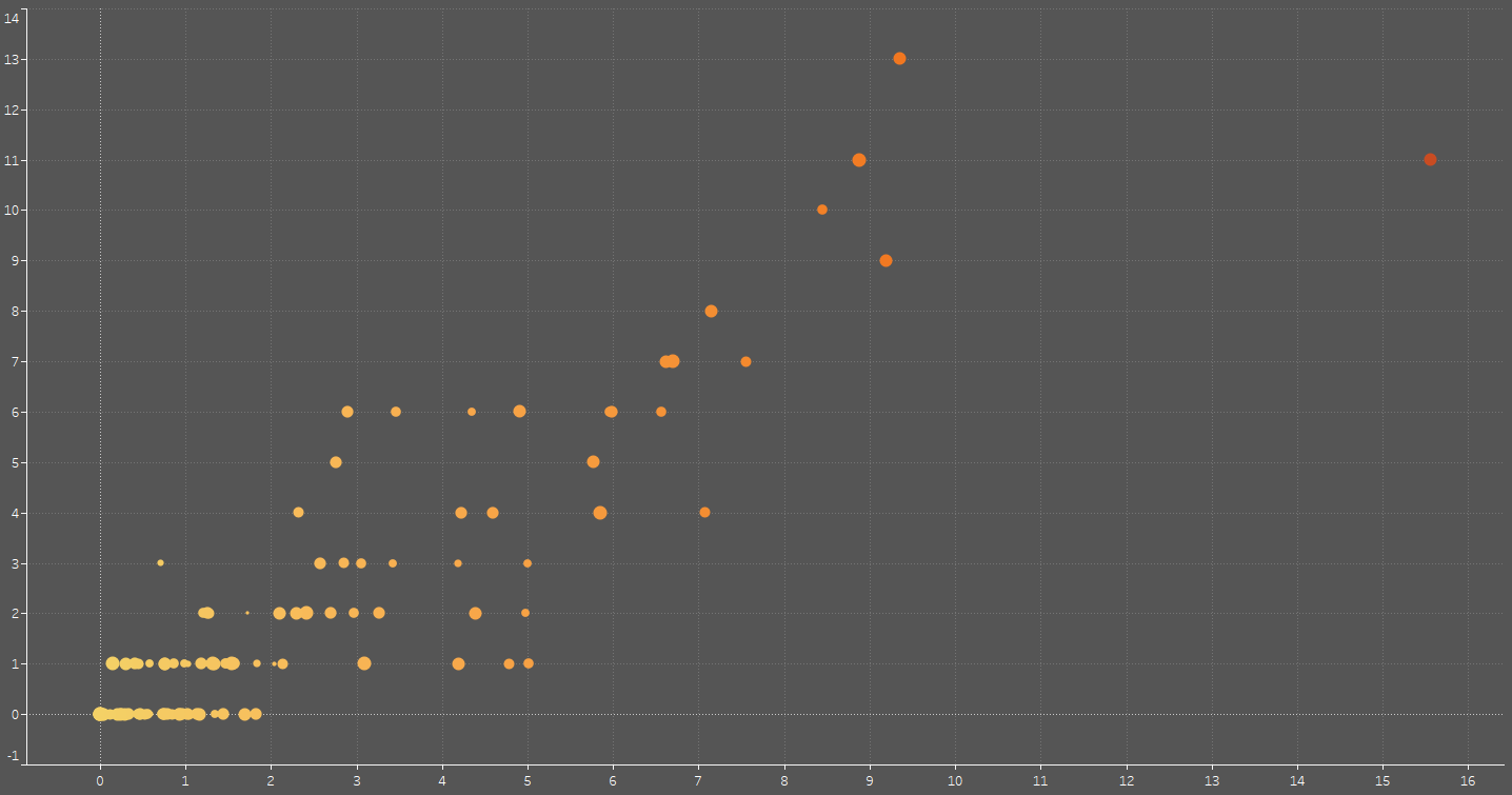
With a scatter plot, you can set up two numeric fields of your choosing on the horizontal and vertical axes respectively, allowing you to spot outliers – such as the prominent one furthest to the right on the image above – relatively easily. Once again, circles represent data points, their position varying depending on the value of your chosen numeric fields.
In some cases, certain kinds of software may allow you to make use of more than two fields on a scatter plot; this is the case with Tableau, which is what is utilised for each of the visualisations shown thus far. You may be allowed the freedom to customise colour, size, and shape of your data points to break down your analysis even further, although going too far with this may potentially make your visual harder to interpret. Sometimes, it is best to keep things simple.
Thus far, we have identified some methods that could help you spot extreme values. Keep an eye out for an upcoming article, where we will discuss situations in which it makes sense to keep such data points around, or when to send them packing.
If you are interested in making use of our services to spot these kinds of patterns in your data, or for other data issues that you may come across, you can reach out to us and request our consultation services with one of our experts at [email protected] – our first consultation is also free of charge.