Visualising the World Cup 2018 predictions with Tableau
The World Cup has come and gone, 4 weeks of back-to-back games resulting in a culmination of the 2 best teams playing it out for the trophy. There were many surprising twists and turns in this tournament, beginning with some favourites being eliminated early and some very late placements.
As with many companies nowadays, the iMovians wanted to get in on the World Cup action and submitted their predictions for the entire tournament from the Group stages all the way until the Final. We decided that the best way to visualise the scoreboard was to create a dashboard on Tableau. This involved a number of steps and I’m going to guide you through the whole process.
Before even trying to load the data into Tableau, the traditional Tournament Excel sheet was converted into something slightly easier for any program to read:
From this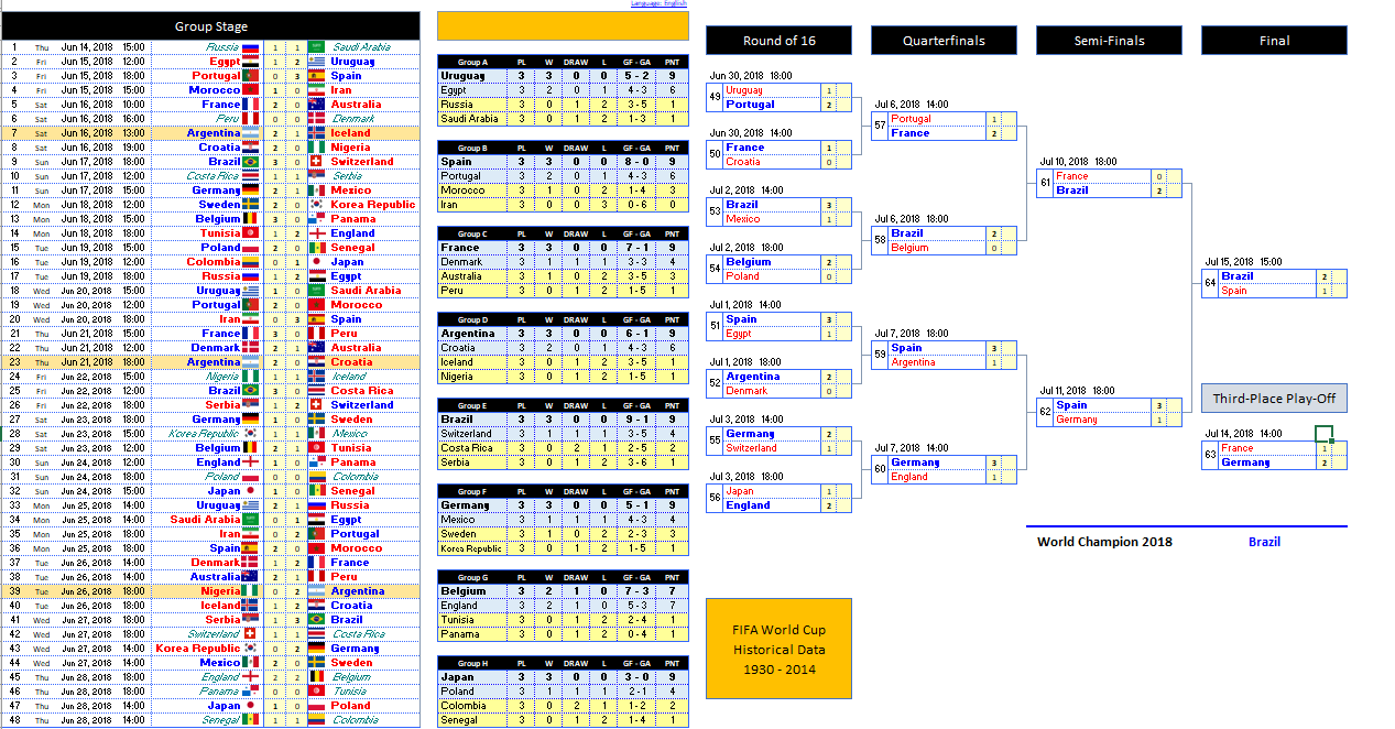
To something slightly more manageable like this 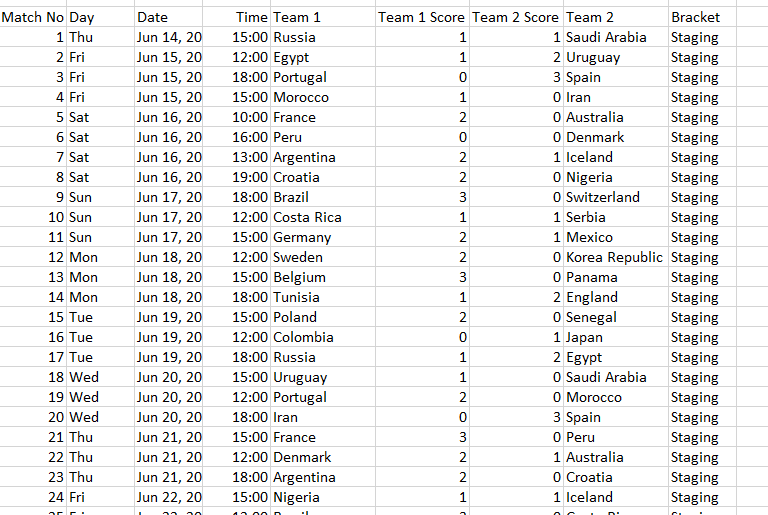 At this point, you’re probably thinking, ‘oh that’s easy now all you have to do is just plug it in Tableau and you’re done!’. However, it’s not that simple.
Next, we need to go over the point system. If you predict the final outcome of the match including the score correctly, you are awarded 3 points, if you don’t predict the score but still have the correct winner you get 1 point.
Data Preparation!
Before I even got started doing anything inside of Tableau, I needed to ensure that my data, coming from 12 different sources all matched up and was cleanly processed:
Tableau Prep makes this especially easy to do 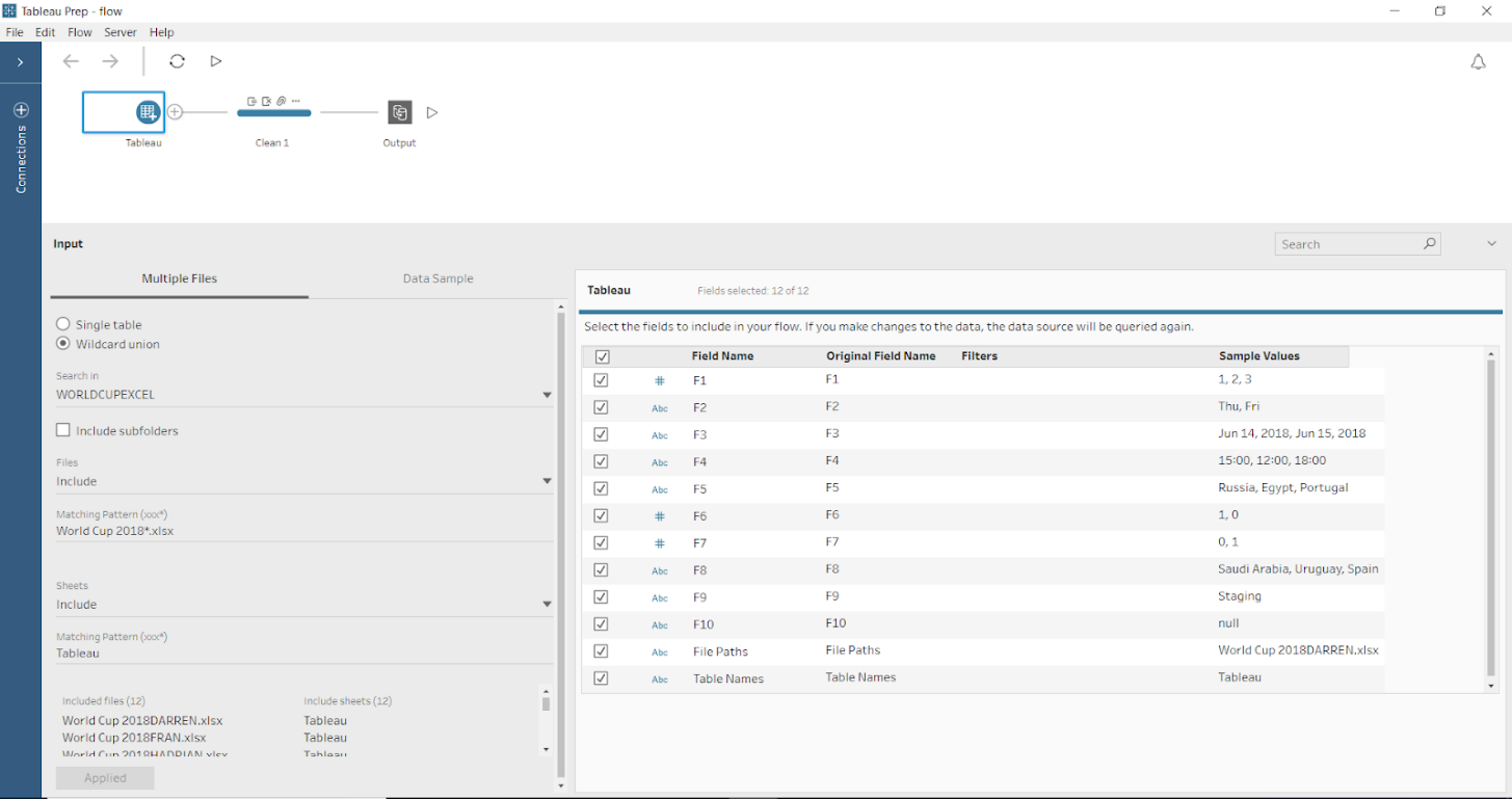
As you can see from the above, I used Tableau Prep to clean the data. Since the output was going straight into Tableau Desktop, then onto Server, it was best to use Tableau products to ease the process of all this data.
At the time of writing this article, not all of the connections from Desktop had made it into Prep so while more connections will be available in the future, I still needed to join the data inside of Tableau Desktop. Using Prep to keep an extract of all the predictions was the smart route to go since this data does not change and therefore wouldn’t need to be reloaded each time.
There were a few changes to be made 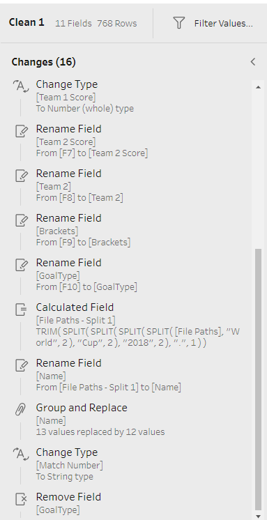
Now all I needed to do was plug it into Tableau, and join it onto a Google Sheet document that was keeping the actual result of all the games.
I also joined it to an Exclusions Table which is also on Google Sheets (to exclude the scores of people that gave their predictions late). While all of this sounds like a handful it’s really easy to do in Tableau. 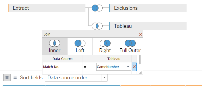
We’re starting to get somewhere now 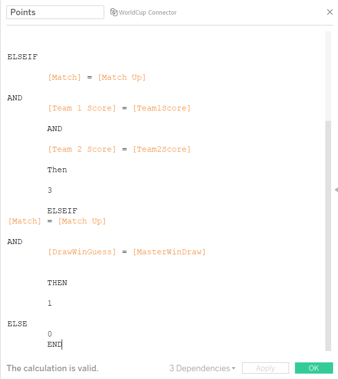
Since the datasets are similar to each other I’ve put in an IF statement that compares the actual result of the match to the predicted result of the match, where the match number is the same (this is why ID’s are important!).
5 Matches in and no clear winner in sight!
Group Stage point system
The Elimination stage was over and it was on to the Group stages … this is where I had to reread the initial email and update the points system. 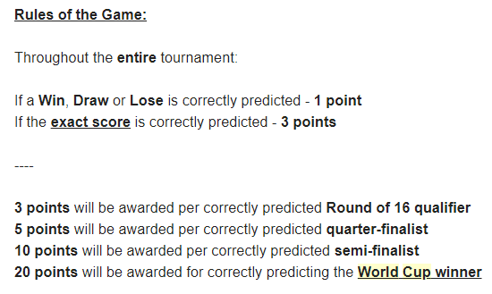
This is why it’s important to read an entire email
I quickly wound up another instance of Tableau Prep and got to work on the Round of 16 system. I created a new data source which joined the predictions and the reality together to get even more points. 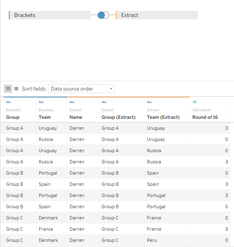
We’re close to wrapping up I promise.
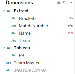
Finally, we needed to change our data from rows to columns. To do this, I took the data into Tableau Prep, Pivoted the Teams into one column and left only the stage that they got to. 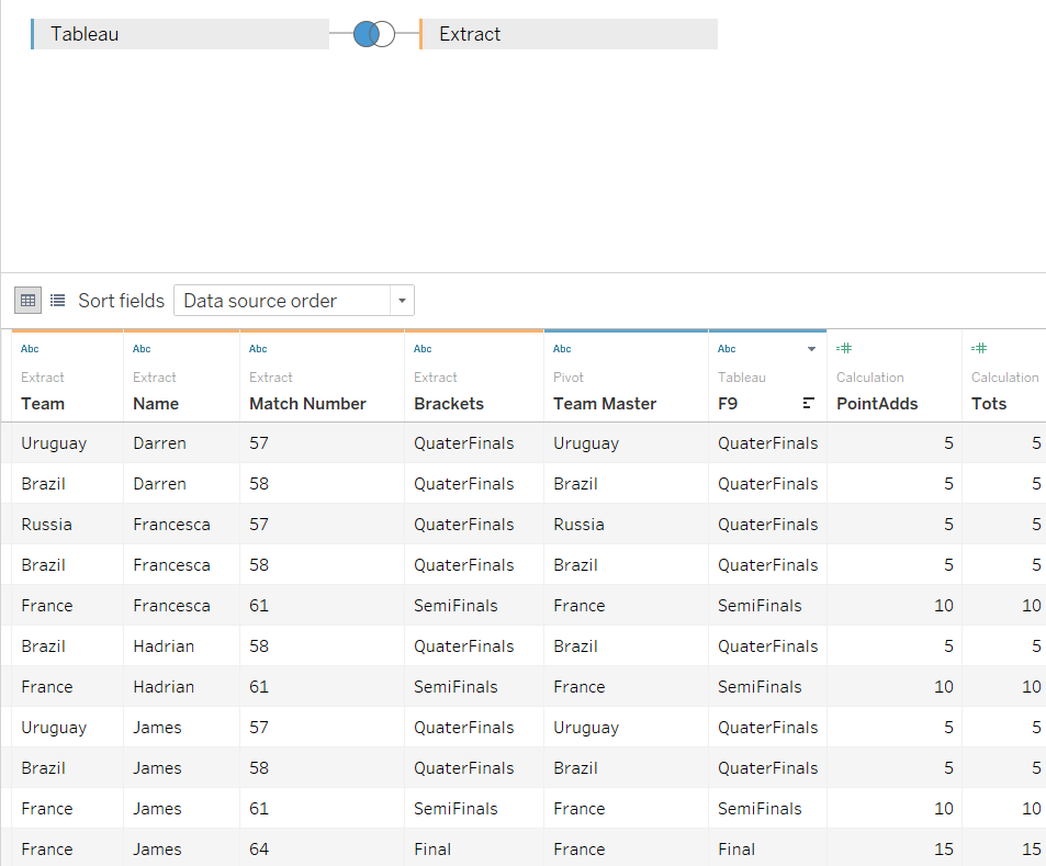
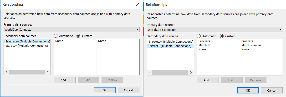
The final step was to use Tableau’s engine to Blend our data sources together.
Data blending is a method of combining data from a primary table of data from one data source with columns of data from another data source. Usually, you use joins to perform this kind of data combining, but there are times, when it’s better to use data blending.
Make sure to blend it until it’s nice and smooth
We’re finally here, at home stretch, just one more piece of the puzzle to put together: adding the points. 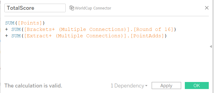 Blends are very complex but to explain it as simply as I can, they require the data coming from the source to be aggregated, but since you define the relationship between the sources you can still get filters and information in the relevant places.
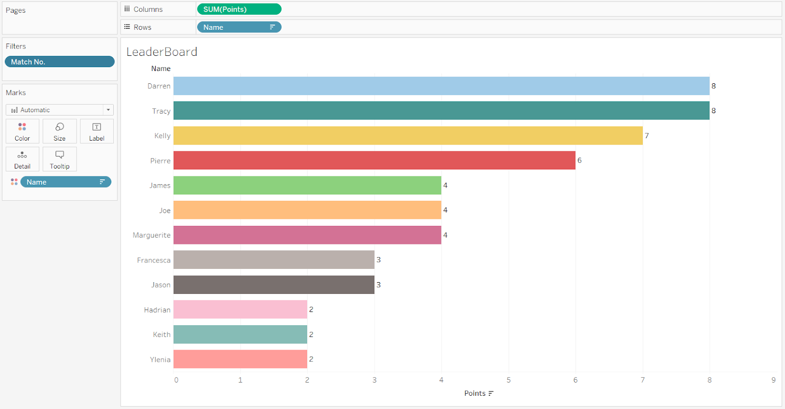
With all this in place, I can finally show you the final outcome. Have a look at how the iMovians predicted Russia World Cup 2018.