COVID-19 Data Storytelling
The ongoing COVID-19 pandemic is dominating all the news right now, and with over 400,000 people infected worldwide, it is understandable why this has been the case. We have seen nations deal with these outbreaks in many varying ways, although many have followed similar paths: first remaining calm, not believing it is much of a threat, before a sudden change of script with the themes of isolation, social distancing, and lockdowns.
The nation that has been the main focus of attention is China, where the outbreak originated, and despite spreading far enough to infect over 80,000 inhabitants, they seem to have successfully curtailed the outbreak of late, and now also boast recovery rates of over 80%, while its death rate has stabilised at around 4%.
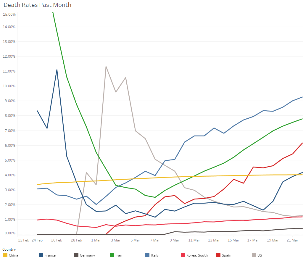
This chart shows the 8 countries with the largest number of confirmed cases as of the 22nd of March 2020. Amongst the other nations which have been heavily infected, there seems to be further cause for concern in Italy, with a death rate that has now increased to over 9%, while similar issues are at hand in Spain and Iran – the latter initially had quite a high death rate combined with small sample size, and while the rate of deaths had seemingly decreased by early March, this went hand in hand with a huge increase in new cases. This could presumably be down to a lack of proper preventive measures, and it is a case which highlights how quickly the virus can spread. Similarly, the United States also seemed to have a high death rate relative to other countries, although this is likely due to misdiagnoses actual numbers of cases not being disclosed: the 100th case was confirmed on the 4th of March, but there were over 33,000 cases confirmed as of the 22nd of March.
Another prominent example of the quick spread comes from an outbreak occurring on a cruise ship:
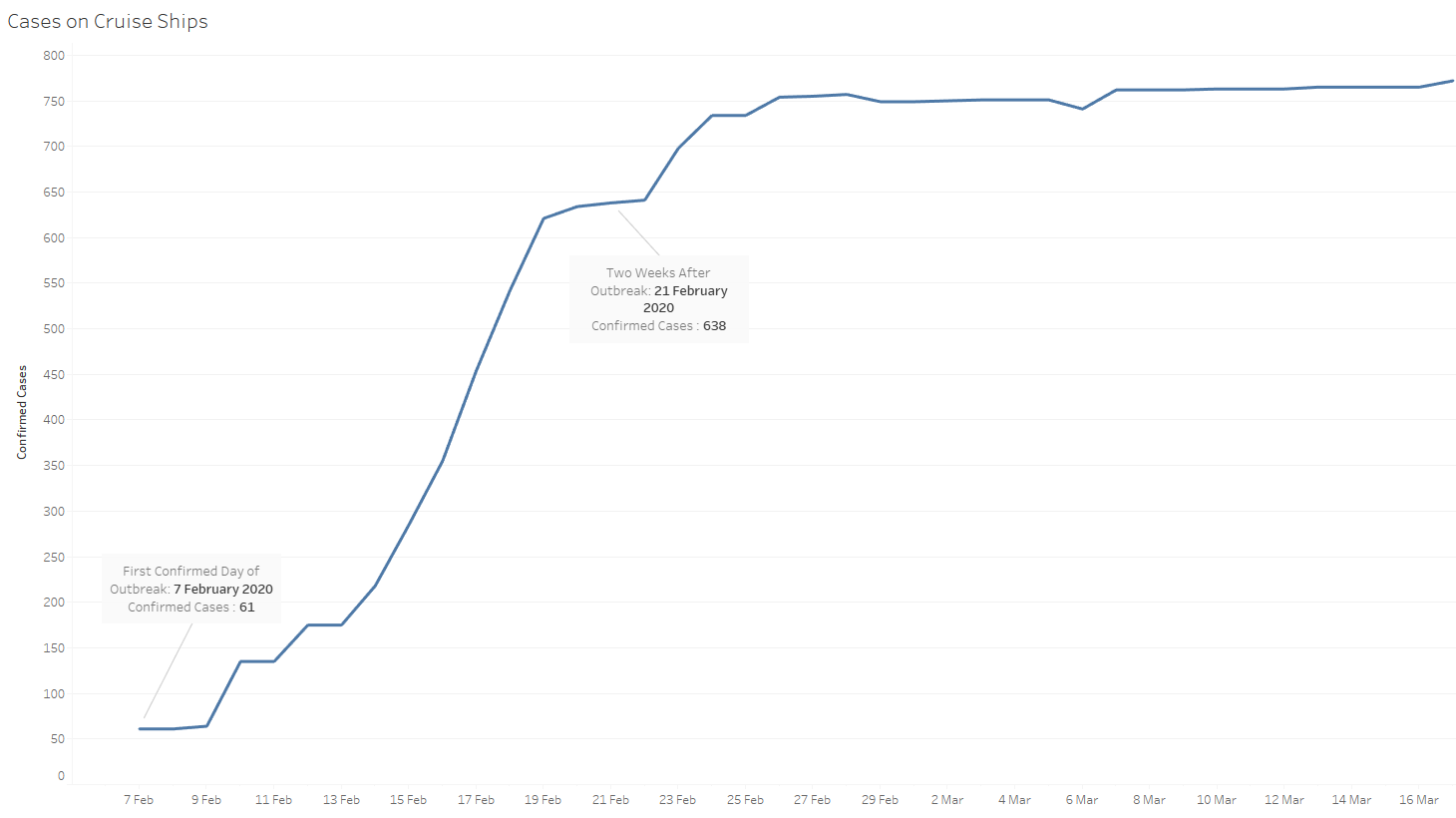
Due to several people being together in a relatively confined space, one can assume it was quite hard to practice social isolation, thus allowing the virus to spread quickly.
As already mentioned, China seems to slowly be recovering from this pandemic, and because of this, they could perhaps be seen as an example to follow – ideally, without having to reach similar numbers of infected inhabitants, of course. However, there are a few other nations which stand due to seemingly having contained the spread from early on. The following map has nations coloured depending on how recent their first outbreak was: red indicates a very recent first outbreak in a given country, with increasing shades of yellow indicating that more time elapsed from the first outbreak. If a country is in grey, it has either not yet been hit by COVID-19, or there is no data available on it.
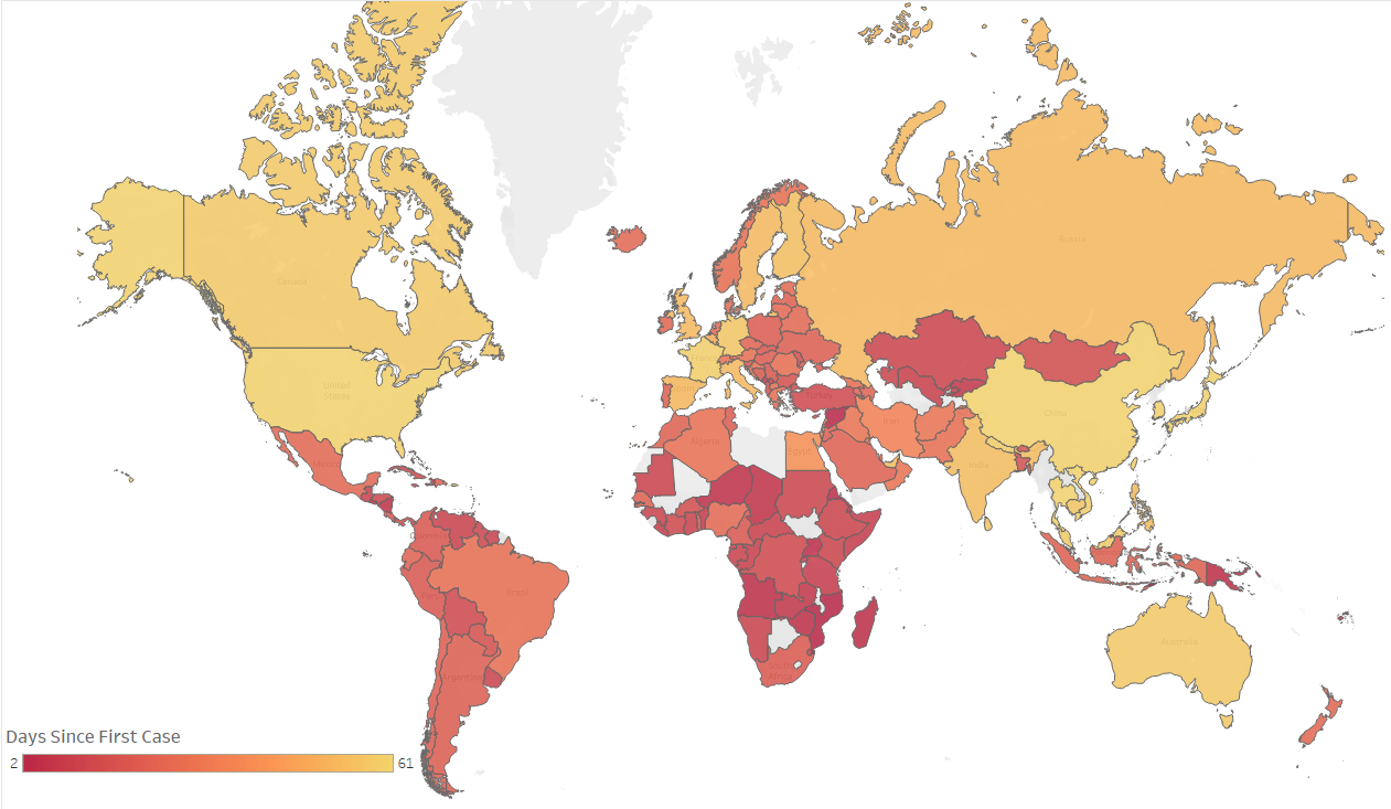
A few interesting cases arise here: by the 15th of March, it had been 50 days after the first outbreak in Australia and they had limited the spread to less than 300 cases. As the virus spreads in an exponential nature, this has unfortunately shot up to over 1314 cases, although relative to other countries whose first outbreak was around the same time, this is still quite a low amount; for instance, France and Germany both have over 16000 known cases.
Japan was one of the first nations to experience an outbreak, but they have successfully managed to limit how fast the virus spreads when compared to other nations. In fact, it took them until the 21st of March for their 1000th case to be confirmed. Finally, Finland only suffered their first COVID 19-inflicted death on the 21st of March and have had 626 cases confirmed thus far. This is only one-third of the number of cases confirmed in both of its Scandinavian neighbours Sweden and Norway, despite Finland having their first confirmed case before both other nations.
One can also note the different cycles of the virus quite simply here: while it reached North America and western Europe quite a while ago, it has only recently started to spread into Latin America and Africa over the past four weeks.
Thus far, there is quite a limited amount of data available, as the initial COVID-19 outbreak was less than 3 months ago, and consequently, it is near impossible to make accurate predictions on the trajectory of the virus. However, one can note common patterns between several nations and use these to inform them of what could potentially lie ahead. Countries that were slow to take action seem to have experienced faster spread rates – one can take France, Germany, and the United States as clear examples of this. However, China provides a clear example that even when the number of infected people seems to be spiralling out of control, the number of deaths can still be suppressed: in the first three weeks of March, they suffered 422 deaths, but 32,537 recoveries were made over the same time span.
These dashboards were created using Tableau software.